Wednesday, August 14, 2019

What is an Editorial Illustration?

Why they are used, and What makes them work.

When I tell people that I am an illustrator, they usually think that I illustrate childrens' books.  After I tell them that most of what I do is editorial illustration, they look confused.


Editorial illustrations function to drive home a point - usually for a written piece - to make it clear, memorable,  and intriguing.  Its purpose must be grasped almost immediately - illustrations are worthless if you have to ponder their meaning.

The illustration I included above refers to the gas attacks on the Syrian people in 2018.   I specifically wanted to highlight how the attacks rent Syrian culture.

I juxtaposed two disparate elements - a gas mask and a sculpture - to make my point.  Putting these two elements together creates surprise, curiosity, and finally, recognition.  If these three elements occur quickly, right after viewing the illustration, the piece is successful.  (Of course, the picture must be designed and executed well.)

I love doing editorial illustrations.  Though they are challenging, when I hit my target, the feeling is thrilling.

Wednesday, July 17, 2019

The Sketchbook - an Illustrator's best friend


One AMAZING source of inspiration

sketchbooks that I use for inspiration


Perhaps the most important job of an illustrator is to come up with clever ways to communicate an idea.  Illustration isn't as easy as "draw this bird so that people know the story is about a bird."  It's more like "draw a chair, and communicate an idea about democracy from your drawing."  Or, in an example I will cite later, use a drawing of tomatoes to make a comment about immigration.

I use a sketchbook to improve my drawing skills, work out compositions, and gather inspiration.  I have been drawing almost daily for four years, and have filled up close to nineteen sketchbooks.  I wasn't expecting my old drawings to be the resource that they have turned out to be.

Coming up with ideas is hard, especially when you are dealing with abstract concepts.  I used to do word associations to try to generate ideas.  Although a good concept, it isn't very satisfying practice.  It's hard to go from words to pictures; better to start off with pictures.  Doodling is one way to generate visual ideas.  Looking at old sketches is another - one that I use often.

Because I try to draw every day, even if for only five minutes, my drawings cannot be "precious".  They are more like a visual recording of my day.  Often, I notice that mundane subjects can be pretty interesting.

In early 2017, I drew these tomatoes:


I noticed their labels - "produce de Mexico".  Trump had just become president, and I knew that immigration and deportation were going to be big issues.  As I drew, I made a note to myself:  "these tomato labels could be important."  I didn't know how, or if, I was going to use them.  Then, one day, inspiration struck.  The result:  An illustration of a Mexican tomato family being deported.

Deportation and immigration under the Trump administration

Another day, I was at the town pond, sitting on my towel and drawing the landscape and the people.  I noticed women sitting in their beach chairs, talking to each other.


Illustrators love to use repetition, so I decided to do an illustration with these women in their chairs, wearing different types of hats.

Watercolor of a summertime afternoon at a pond

I didn't take their picture, or ask them to pose.  I quickly sketched, and used these drawings (plus others), as inspiration for the piece above.  A sketch can capture a gesture that is exciting and compelling.  A labored drawing or photo often destroys that.

A drawing I did at the local mall gave me an idea for my current business card illustration.  I drew a mannequin at a woman's clothing store.


Then, I thought of coupling this mannequin with a small child who mistakes the mannequin for her mother.


My husband told me a story how he, as a small child, had grabbed the wrong woman's coat at a department store.  I have had sleepy children wonder over to me and embrace my leg, thinking that it belonged to their mother.  These stories completed the image for me that had started with a simple sketch.  I will continue to sketch, and use these drawings to tap into ideas that spring from my sketchbook.

Wednesday, July 10, 2019

I Don't Think So

Lessons I learned from looking at old work.

It is really humbling to look back at old work.  I was getting ready to put a series of illustrations about my tonsillectomy (at age five) on Behance.  I found them and said to myself:  "I don't think so."

Here is one of the pictures, which I did in pen and ink and colored ink washes.


Although I would be delighted  if you loved this illustration and thought I was a GENIUS, I would disagree (but would appreciate your sentiment.)

I've worked hard over the last five years to improve my craft, and I've learned a few things.  Perhaps you will find what I've learned useful, or interesting. 

My teachers at the School of the Museum of Fine Arts Boston (SMFA) always said "If you learn one thing, learn how to draw hands."  Now, look at the nurse's left hand; it is disturbingly large and malformed.  My hands are much better now, because I have taken two anatomy classes, drawn daily, and practiced.

I used too much ink and hatching when I drew the terrified little girl on the gurney (me - screaming my lungs out.)  Using less ink and hatching would have resulted in a more satisfying image without losing the terror.

Instead of using watercolors, I used colored inks.  Despite what people tell you, watercolor is not that hard to use.  If you make a mistake, you can often fix it by blotting with water.  No such luck with ink; once it is down, it is there for good.  Ink also reproduces in an odd way.  Some colors come out really strong - others, very muted.  Lastly, you cannot mix different inks - say yellow and red - and get a good orange.

There is also too much going on, with all of the cross hatching and lines of ink.  The busyness distracts from the main image - the little girl and the nurse.  You really want to use as few elements as possible to communicate your visual idea.  

There are elements that work well in this picture.  The overhead view is interesting and frightening.  Because you cannot see the nurse's face, it heightens the feeling of panic.

The negative space is strong.  (Shown by the dark brown areas.)


The part of the picture where "nothing" is happening is just as important where the positive space is.  Good negative space makes the composition visually interesting.

There is pretty good eye "movement" .  A viewer's eye keeps moving around the picture - not getting stuck on any one element, and not flying off the page.


I've shown in red the path that a viewer's eye would take.  This illustration is missing an "entry point", a visually easy place for your eye to enter the picture (often in the bottom part).

I don't get upset about these early adventures that didn't work out as well as I had hoped.  It's all a journey that is satisfying as long as I keep learning.

Wednesday, July 3, 2019

How I became an Illustrator - part 3

Useful insights in designing an Illustrated space

Have you ever wondered how illustrators create their pictures?  It seems easy, until you actually try to do it.


Many pictures for The Little Cleveland take place in the Wellesley Hills Branch Library.  Because I live so close, I was able to go there often and draw the interior from several vantage points.  One problem dealt with - sort of.  A bigger issue was how do you put people in the space, so that they don't look like they are floating, unrelated, too small or too big?  And, where is the best point of view?  Should the bar always be the backdrop?  Probably not.

Some of the tools & methods I use that are discussed in this blog.

How do you populate the space with people?  Pubs are social places, so there should probably be several patrons.  What are they doing?  How can people, who are not the center of interest, enhance the action of the main characters?  And from a design perspective, how do you draw and place these extra people so that they don't distract from the main action?

You could build a physical model and draw the objects.  I did not do that.  Instead, I used advice I got out of a book called Composing Pictures by Donald W. Graham (1970 Litton Educational Publishing, Inc.)  Graham had a long career teaching artists and illustrators at the Chouinard Art Institute (now California Institute of Arts), the Disney Studio training school, and others.

The first time I tackled this detailed, somewhat difficult book was 2011, after I had rotator cuff surgery on my right shoulder.  Being a righty, I couldn't draw, so I spent many summer hours on my front porch reading his lessons and trying to understand them.  It's the kind of book you keep going back to if you are an artist who really likes to get into the weeds of design.

The most important lesson I learned that summer was how to place people and objects in a space, and how to draw them from any angle.  The technique Graham explained to get many viewpoints is called the whirling plan.  Rembrandt used it; I haven't been able to find it on google.

Briefly, you start by sketching a scene, maybe two people sitting at a table.  You then draw a bird's eye view of the scene.  By rotating this bird's eye view, and dropping the people and objects straight down to a normal view, you can visualize many different viewpoints.  This explanation does not really tell you how to use the whirling plan.  If you are interested in finding out how to use this technique, leave me a comment, or get Graham's book.

The neat thing about this method is that as your view changes, other people who are in the room you are drawing may come into view.  Their presence may inform  or amplify the action of the main  characters.

In this image of my Uncle Jimmy flipping a coin to see which of his nieces, my two older sisters Sue and Mary Beth, would get the last pierogi, I show Rusty, the bartender, looking on.


(I cringe when I look at this piece - look at how big Uncle Jimmy's right hand is!  Ouch!)

If I hadn't tried different vantage points, it never would have occurred to me to include Rusty and his quizzical expression.

Another technique I learned is to draw from the back of the picture forward.  Think of it as placing actors on a stage - you place those in the back first, then those in the middle, then those in the foreground.  Renoir used this technique.  Despite the fact that his work goes in and out of fashion, he was a master at placing many people in a painting.

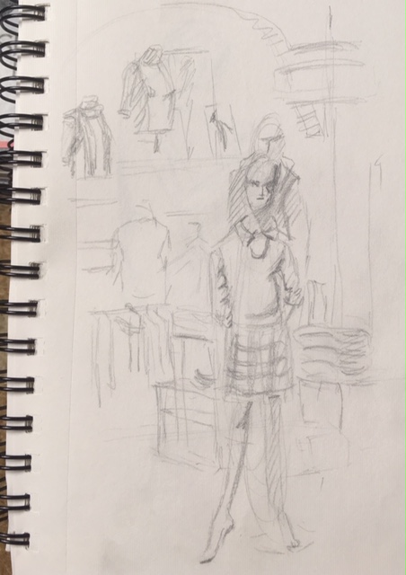
I drew everything in blue pencil first, because it does not show up when scanned - although it appeared when I took a picture with my phone.

In this illustration, my neighbor confronts my beleaguered mother about the damage that rabbits  caused in his vegetable garden.  My Uncle Norm had found two jackrabbits on a golf course and brought them, to his nieces and nephews delight, to our house.  He erected a makeshift pen out of picnic benches.  Rabbits being rabbits, they immediately jumped out of their pen and hightailed it to Mr. Prusha's vegetable garden, where they had quite a feast.


 I placed the action in the garage, as my mother unloads groceries from one of her never-ending food shopping trips.  Again, I used the background to inform the main action.  A tricycle and bicycle are stationed underneath treacherous gardening tools.  They illustrate, for me, some of the perils of childhood.

Also, look closely at the picture.  You can see the underdrawing of the background, with the foreground objects drawn right over it.

In summary, I used a few really useful techniques when I wrote and illustrated The Little Cleveland.  I continue to use them.  They are:

   - Look at the action from different vantage points.  You can often amplify the action and emotion of the scene you are illustrating.
   - Start drawing objects in the background first.  Then, stack the middle ground, and finally the foreground objects on top of these.  Either draw very lightly with a soft pencil (easiest to erase) or a blue pencil (some people don't like them because they are waxy.)

Next time - growing as an illustrator, and looking back at earlier work.


Wednesday, June 26, 2019

How I became an illustrator - part 2

How Writing and Illustrating The Little Cleveland got my illustration career started

For several years I dreamt about writing and illustrating a series of family stories.  Most of the action would be anchored in a place I called The Little Cleveland, an imaginary bar in Wellesley, MA, where I have lived since 1984.


Wellesley doesn't have any true bars, taverns or pubs.  Any establishment that sells alcohol for consumption on the promises has to serve more food than alcohol.

There is a lovely little library within a short walk of my home.  It has two fireplaces, built-in benches, and leaded glass windows.  It is the perfect place for a pub; a place that reminded me of home, where people went to pubs, not to get drunk, but to socialize, and have a pleasant and inexpensive evening out.  Writing and illustrating The Little Cleveland was a way for me to recapture that comfortable, welcoming feeling.

I had no idea how to write, or tell stories.  My father, uncle and grandmother recounted wonderful tales - about themselves and about relatives.  

I was too shy as a child to talk about myself, or even to say what I had done that day.

Even though I had no confidence in my storytelling abilities, I wanted to communicate our family mythology.  I found several books on how to tell stories.  The one I found most helpful is called The Power of Personal Storytelling - Spinning Tales to Connect with Others by Jack Maguire (Jeremy P. Tarcher/Putnam - 1998).

I developed a simple rubric for the narratives I ultimately wrote:
1. Start with the status quo.
2. Take note when something starts to change.
3. Emphasize when a turning point is reached.
4. Resolve the story.

Once I had this rubric, I started writing.

I did not start with an outline.  The Little Cleveland quickly developed a structure, though.  It started with a preface - about my father.


It then followed a woman who thinks she is going to her local library for a book chat, only to find it transformed into a pub (much to her initial annoyance).  She is right to be annoyed and thrown-off balance.  The library has been transformed, as if by magic.  The Little Cleveland becomes her Brigadoon.


Finally, stories are told about  people in my family.  Everyone always ends up at The Little Cleveland - meeting friends, commiserating with Rusty (the bartender), playing cards and eating (fish fry, steak tips, and pierogis).  I wrote stories about Ruth, the woman who was initially annoyed.  She wasn't based on a family member, but someone I know locally.  As I wrote my stories, I found that adding stories about her helped maintain a narrative thread throughout The Little Cleveland.

One of the last stories in the Little Cleveland  has helped me resolve issues with my Dad - something I couldn't do when he was alive - he died when I was sixteen.

Next week, I will write about how I learned to compose the illustrations.  Ultimately, drawing pictures for twenty-four stories, and posting them weekly, launched me into my career.

Wednesday, June 19, 2019

How I began my life as an illustrator

Have you ever wondered how someone becomes an illustrator?  For me, it has been a circuitous path that started in fifth grade at St. Dominic School in Shaker Hts., Ohio.  That year, we actually had an honest-to-goodness art teacher.  She was a young sister - a large, friendly woman with dark, curly hair.  And, she taught us how to draw people!

Her technique was to draw loose loops and ovals for the hip, trunk, limbs and head.  A lightly drawn line was used to indicate the spine.

This picture shows what a drawing using this technique looks like:


Being able to draw people thrilled me.  I had been given a key to a new world, similar to gaining the key of reading.  I started annoying everyone in my family, making people pose for me so that I could draw them.  I copied Rembrandt and daVinci drawings.  I pestered an artist, Florian Lawton, who lived down the street, to guide me.  He did so with grace and patience.  I copied people out of magazines.  I drew constantly.

My mother enrolled me in Saturday life drawing classes at the Cleveland Institute of Art.  It was the first time in my life that I felt totally comfortable - I had found my people.

Years passed.  I took art classes in high school.  Then I stopped, because art was not a realistic career.

Happily, I took a watercolor class at a local community college when I was a young adult. Our teacher taught us how to draw in perspective, so that "things would look real".  He had given me another key.  Like that little kid I was so long ago, I started drawing everything in perspective until I understood the process.

From that point, I drew and painted with watercolors often.  One day, I told my ever-patient husband that I was going to do art for a living.  I assured him that I would quit if I didn't make any money in a year.  "But you have an M.B.A.!" he cried.  He gave me a year.  That was over thirty years ago.  He has only bugged me a few times about my promise.  (He is going straight to heaven.)

Next time, I will tell you the story of how writing and illustrating The Little Cleveland, my fictionalized family memoir, finally got me into the Illustration business.